WOODEN FURNITURE & HOME
Mixing wood tones doesn’t require a matching floor, table and cabinet. Start with the wood that already occupies the most visible space, then decide whether the furniture should blend with it or stand apart. Compare the actual finishes in your room before buying: a promising brown on a screen may look quite different beside your floor.
Let the floor or largest cabinet lead the wood palette
The dominant wood is the surface your eye keeps returning to, rather than whichever finish appears on the most objects. In an open room, that may be the floor. Under a broad rug, a tall cabinet or dining table may command more attention. Treat that prominent surface as the starting point for your next furniture choice.
Ask which large wood surfaces you’re keeping. A fixed floor and a favorite sideboard deserve more weight in the decision than a side table you’re happy to move. Put the furniture choice beside those fixed pieces before judging it against paint, cushions or small accessories.
For example, imagine a honey-colored floor, a dark inherited cabinet and a new dining table. I’d compare a table that clearly relates to either existing surface before introducing an unrelated gray finish. That’s a way to narrow the shopping choice, rather than a rule that the table must match.
The broader decorating with wood guide places these color decisions alongside textiles and everyday use. Here, keep the main question on the large surfaces: which wood leads, and which piece gets a supporting role?
Separate wood undertone from light-dark contrast
Once you’ve chosen the starting surface, compare two different qualities. Light-dark contrast describes how pale or deep a finish looks; undertone describes the yellow, orange, reddish or gray cast you notice within that color. A pale table and a dark cabinet can differ strongly in depth while still looking related in color.
Use those words as observations, not product guarantees. A label such as natural, oak effect or walnut finish doesn’t settle the comparison. I’d ask for a finished sample, place it beside the floor and view it near the furniture it must join. Compare it in daylight and again with the lamps normally used in that room.
If the sample seems gray beside a golden floor, decide whether you enjoy that contrast before adding more pieces in the same finish. You don’t have to eliminate the difference. You do need to judge the combination together, rather than approving each brown separately in a shop or photograph.
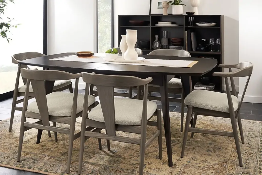
In the dining room below, the chairs read lighter than the dark table and cabinet. The broad upholstered seats and rug also contribute to the palette, so the wood colors aren’t carrying the whole arrangement.
Choose a clear contrast when similar wood finishes feel wrong
An almost-matching finish can be harder to assess than an obvious difference. Suppose a new table is close to the floor in depth but looks noticeably pinker beside it. If the near match bothers you, compare a clearly lighter or darker option before trying to find another almost-identical brown.
Keep the shape and visible wood area in that comparison. A thin dark table frame and a broad dark cabinet don’t make the same contribution to a room. I’d be more cautious about adding another large, strongly grained surface when both the floor and an existing cabinet already draw attention.
Check the furniture’s practical fit before settling its finish, too. A color you like won’t solve an awkward reach from the sofa; the wood coffee table guide covers that size and placement decision.
For a quieter look, consider upholstery, a painted piece or a glass top among the wood furniture. You can change the amount of exposed wood without replacing every brown surface. Don’t choose a new finish solely because a room photograph makes the combination look effortless.
Repeat a wood tone where the room needs a connection
After choosing the contrast, look for an existing tone that could connect separate parts of the room. Repeating the chair color in another substantial piece is one option. Moving a side table into the same view may be enough; buying a complete furniture set isn’t the only route.
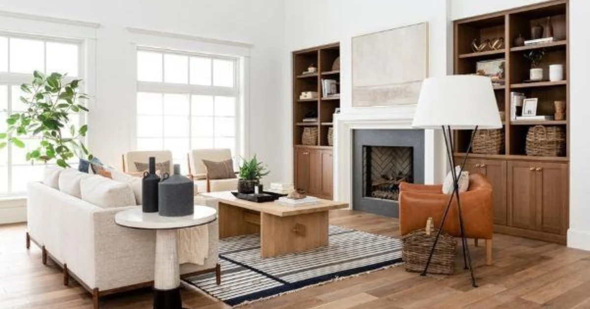
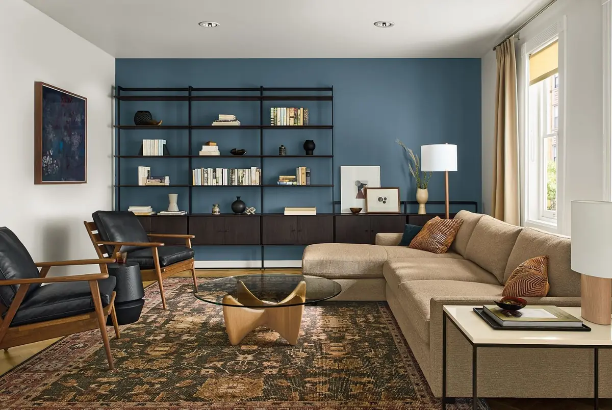
The living room below places similarly warm-looking wood on both lounge-chair frames. The darker storage unit remains a separate element, while the rug and upholstered sofa occupy much of the visible area. Follow the chair frames across the room before looking at the smaller objects on the shelves.
I wouldn’t turn repetition into a required count for every finish. A single cabinet you love can remain a focal piece, especially when its shape or position already gives it a clear role. The useful question is whether a repeated tone improves the room, rather than whether every wood has a partner.
If a small table is the movable piece, compare its top and frame as well as its finish. The modern wooden side table guide looks at how those parts affect its place beside seating.
Use a rug or varied grain to bridge wood surfaces
Repetition may leave a table and floor feeling too similar where they meet. A rug is worth trying there: it introduces a different surface around the furniture legs and lets you judge the table separately from the boards beneath it. Choose a rug you want to live with, rather than treating it as a way to hide the whole floor.
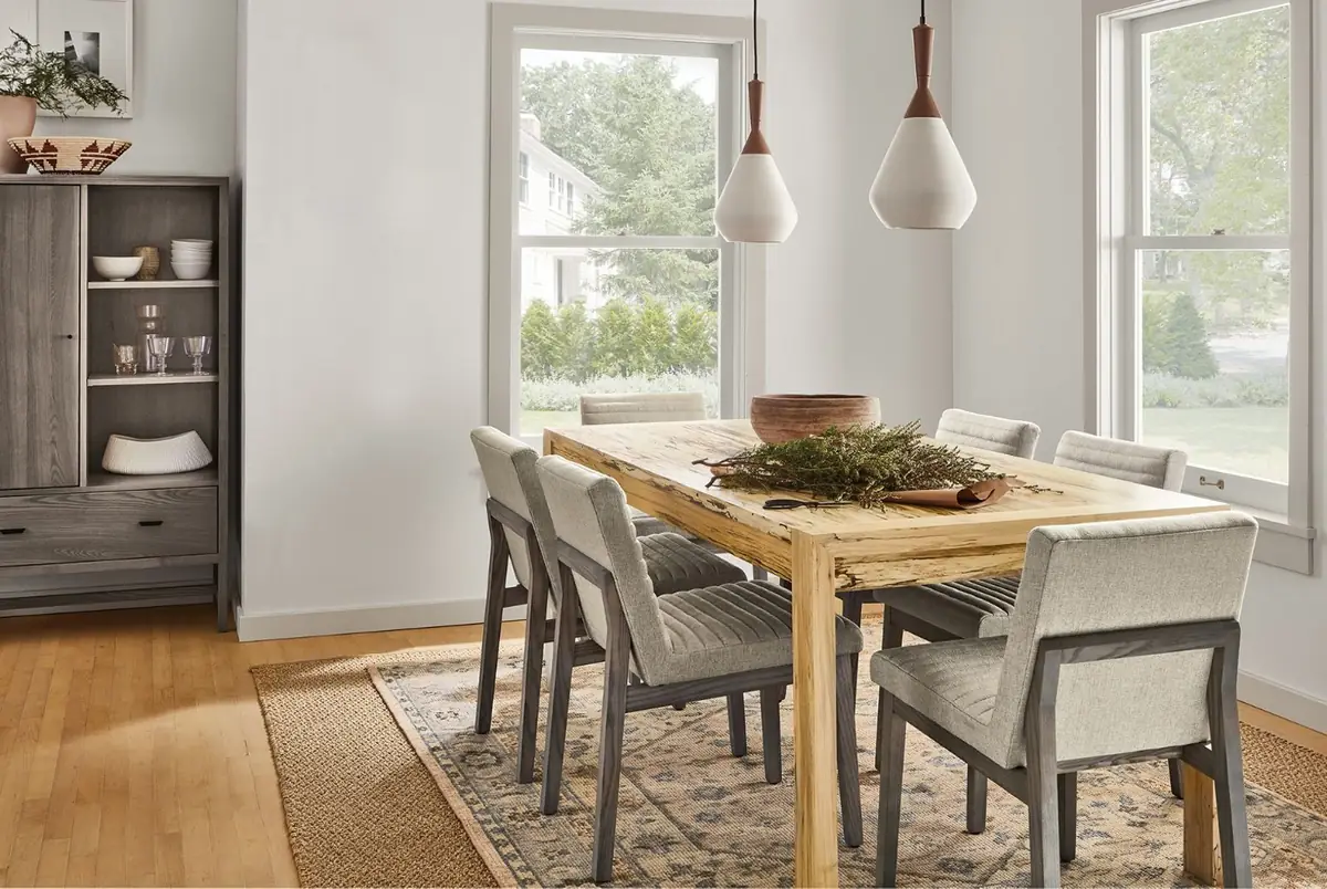
The dining room below offers another useful comparison. The table shows pale and darker markings, the floor reads golden, and the cabinet and chair legs read darker. The rug separates much of the table’s base from the floor; the upholstered chairs leave less exposed wood around the tabletop.
A varied-grain piece can be a candidate when it visibly contains colors you want to connect. Compare the particular piece or a representative sample, though. A wood species name doesn’t promise that every tabletop will carry the same range of marks and colors.
Keep this room-scale decision separate from filling the surfaces with matching objects. Once the furniture works together, the wood decor ideas guide covers the smaller trays, bowls and tabletop arrangements.
Resolve the awkward pairing before replacing furniture
When the room still feels unsettled, name the specific pairing that bothers you. Is the cabinet too gray beside the floor, is the table disappearing into it, or are several bold grain patterns competing? Those are different reasons to reconsider a piece, and each deserves a different comparison.
Try a reversible change first: move an existing table, bring a rug sample into the room or remove a wood piece from the main sightline. Then look from the doorway and the seat you actually use. A close-up finish comparison won’t tell you everything about how a cabinet reads across the room.
If the problem only appears under the evening lamps, compare it under those lamps before ordering. If the color works but the room feels crowded, reconsider the amount and placement of furniture before changing its finish. You can keep an inherited cabinet and let the next purchase do the adapting.
Save the combinations you prefer with notes about the actual finishes and room lighting. When you’re ready to tackle another room, Wood Center has furniture and decorating guides to help with the next practical decision.