WOODEN FURNITURE & HOME
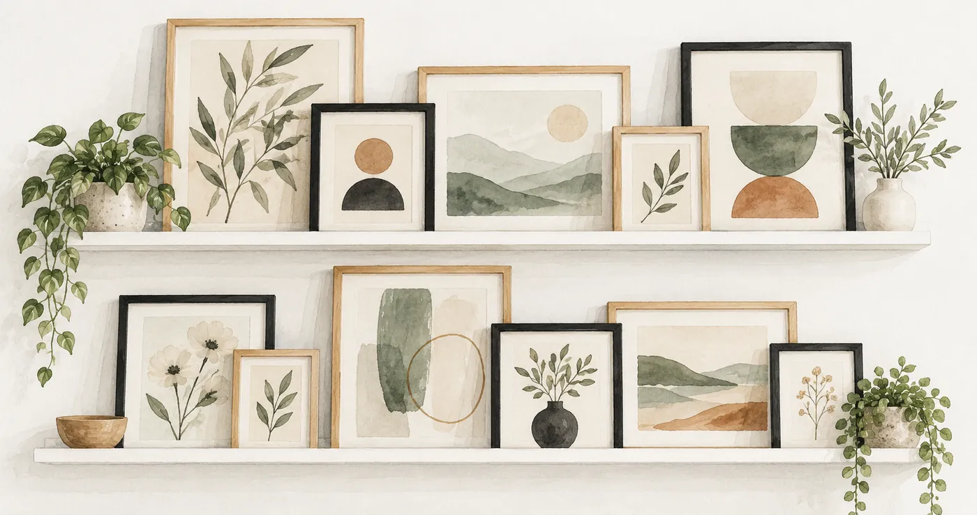
Picture frame shelves work well when the largest picture stays readable behind the smaller ones. Start with the finished outside dimensions of your frames, check the ledge’s usable depth, and overlap borders before covering the artwork itself. A shallow wood display ledge can hold a changing arrangement, but the shelf’s shape and product limits decide which frames belong on it.
The useful decisions come in that order: fit, visible layers, then the relationship between the ledge and the room. Color choices can wait until the pictures sit together comfortably.
Match the picture ledge to the frames you already own
Measure each frame across its outside edges, including the height. The size printed on a photo or print does not tell you how much wall space its frame occupies. Lay the frames together on a table and note which ones can stand behind others without losing a face, signature or important part of the image.
Shelf depth needs a closer look than the overall dimension on a listing. A raised front lip, back edge or groove can reduce the area available for frame bases. Check the product drawing and side view, and account for projecting hardware on the frame’s back. Two slim frames may fit where one deep box frame occupies the whole ledge.
The empty ledge below makes the front lip and the groove behind it visible. Those details affect where a frame rests, so compare them with the bottom edge of your actual frame.
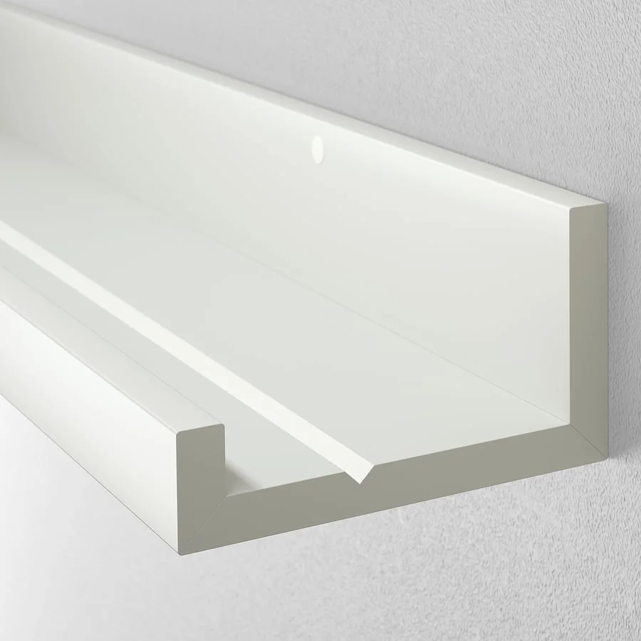
Read the height limit as well as the weight limit. IKEA’s MOSSLANDA white 45¼-inch ledge, article 902.921.03, is recommended for pictures no more than 17¾ inches high; its warning says taller pictures may fall. That restriction belongs to that model. Another ledge may have different limits, even if its length looks similar.
Use the chosen manufacturer’s instructions for weight, frame height and suitable wall fixing. Include every displayed object when checking the load. A deeper shelf or a stronger-looking lip is not evidence of a higher capacity. Once the product fits, compare the ledge with the room-wide wood palette before filling it.
Build visible layers around one main picture
Once the frames fit the ledge, choose the picture that should be noticed first. Set that frame toward the back and place a shorter frame beside it, slightly forward. Move the smaller one across the larger frame’s border until both images still make sense. The overlap should connect the group without turning the main picture into a background pattern.
A tall picture does not have to sit in the center. An offset arrangement can leave room for a smaller photograph at the opposite end. Keep some shelf visible so the display reads as a group of pictures resting on a ledge, rather than a solid strip of frames.
On the pale wall below, the larger frames sit behind a small picture and a little frame at the right. Their differences in height leave the back row visible.
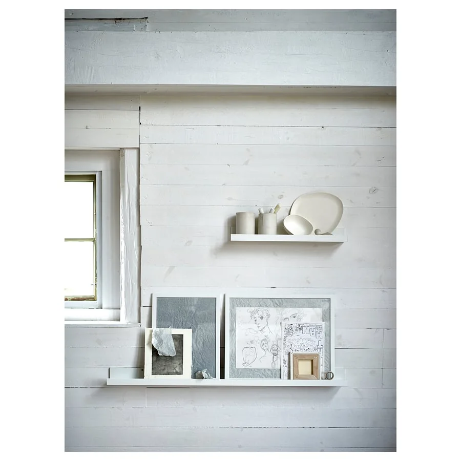
Judge overlap from the place where you normally see the display. A face that looks clear while standing close to the shelf may disappear behind a foreground frame from a chair. Shift the front picture sideways before raising or replacing anything. The important test is whether the subject remains readable from that viewpoint.
For questions about the frame itself, use our guide to wooden frame tones, profiles and mats. Here, the frame’s outside outline matters because it determines how much of the neighboring picture remains visible.
Vary picture frame heights without creating a crowded row
After placing the main picture, use changes in height to separate the remaining images. A row of equally tall frames can look orderly when their edges remain apart, but overlapping them often hides too much of the back row. Try a shorter landscape frame in front of a taller portrait frame and compare the result with the positions reversed.
Keep image content in mind as you shuffle. A small foreground frame can cover the empty sky in a landscape more comfortably than the central figure in a portrait. A broad mat offers another area for overlap, provided the frame behind still has a clear outline. There is no useful universal overlap percentage: the pictures decide where the acceptable edges are.
Treat objects as part of the same composition. A small bowl may fill an otherwise awkward gap, but a tall vase can obscure a picture just as completely as another frame. Start with the art, add one object if the arrangement needs it, and remove the object if it makes a picture harder to see. The same restraint helps when choosing small wood accents beside a framed display.
Leave room to change art between stacked ledges
With a single row settled, consider whether another ledge adds useful display space. Measure the intended gap using the tallest finished frame on the lower row. Allow room to lift and remove that frame beneath the shelf above, and preview the positions before committing to the arrangement.
Several ledges on this gray wall carry pictures and printed pieces at different heights. The open wall above each grouping helps distinguish one row from the next.
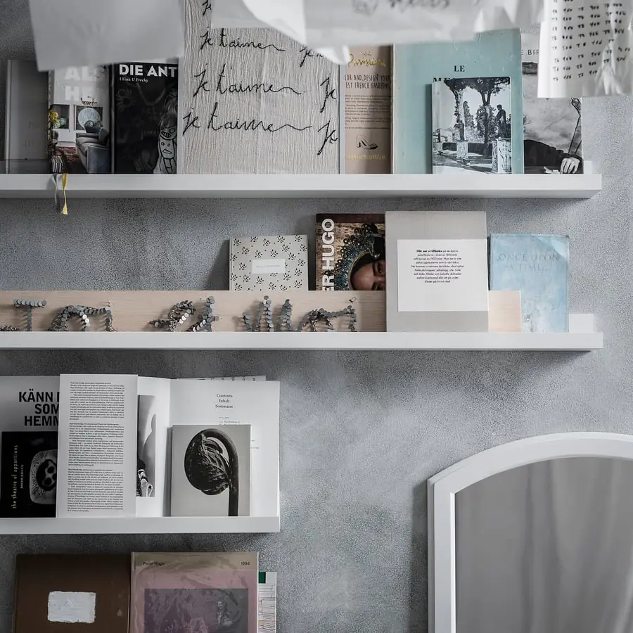
Avoid filling every row to the same density simply because the shelves match. A quieter upper row can balance a fuller lower row. Step back far enough to see the entire wall, then check whether the shelf lines or the artwork dominate. Remove a picture temporarily if the rows merge into one busy block. If several rows remain too busy, compare the scale and pattern of a single wood wall panel as another wall-art direction.
Read the picture frame shelf arrangement within the room
The finished display should connect with nearby furniture without obstructing its use. Preview the composition with the sofa, console or desk in view. A frame that leans out into a passing route, or sits where someone regularly reaches, needs a different position. Keep fragile pieces away from locations where they are likely to be knocked. When the pictures sit above an entry console, check the console footprint below the display before settling the wall arrangement.
Compare the ledge finish with the surrounding wood using our wood decorating guide. A painted wood-based ledge can recede into the wall, while a visible wood finish adds another horizontal band to the composition. Verify material descriptions before buying if solid wood matters to your choice.
Finally, view the pictures with the room’s usual lamps on. Reflections may hide a favorite image even when the overlap is right. Swap its position with a less reflective piece and look again from your seat. Leave the arrangement with clear subjects and enough access to change a picture without dismantling the whole row.