WOODEN FURNITURE & HOME
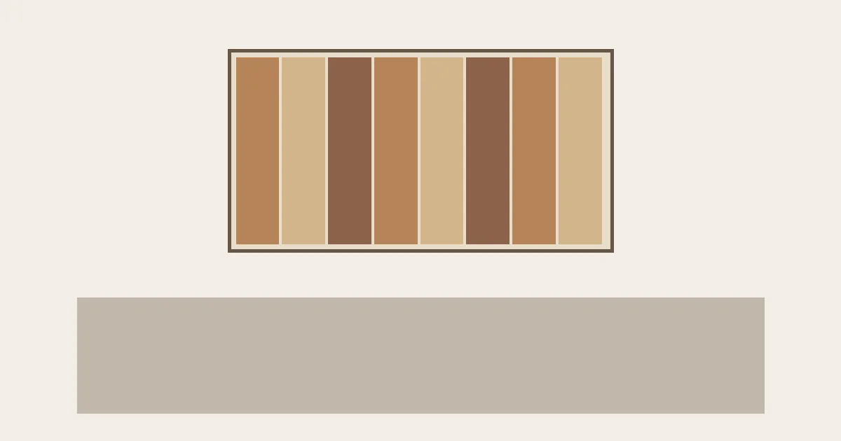
Scrap wood wall art can look balanced in a room when its overall pattern suits the viewing distance, its colors relate to nearby furniture, and its size fits the wall above that furniture. Choose the finished composition first, then examine the grain and surface details. A beautiful collection of small wood pieces still needs to read clearly from across the room.
The decisions here concern buying and displaying a finished panel. The useful question is what the assembled artwork adds to your room: a quiet band of color, a strong geometric shape, or a surface with pronounced shadows.
Read the wood pattern from across the room
Start with the outline and the arrangement inside it. Narrow strips pointing toward a center can create a focal point; parallel strips give the eye a repeated rhythm. An irregular patchwork may feel lively up close but look like a single mottled rectangle at the distance from your sofa.
When browsing, look for a room view as well as a close-up. The room view helps you judge the composition; the detail view helps you inspect the finish. If the listing only shows a tightly cropped surface, ask for a photograph of the complete panel before deciding.
A useful editorial preference is to keep the main pattern recognizable without relying on tiny differences between individual scraps. That leaves room to enjoy the grain later, when you walk closer. Very intricate work can still belong in a small reading corner, where close viewing is part of the setting.
The outer border matters, too. A dark, broad border makes a firm rectangle around a busy arrangement. A slim border lets the separate pieces carry more attention. Compare the whole outline against your wall rather than choosing the border in isolation. If the panel will share a wall with prints, compare their wooden picture-frame borders alongside the panel outline.
Separate wood color from surface relief
Once the arrangement reads clearly, decide whether color or physical depth should do most of the work. A flat panel can have a strong pattern through contrasting finishes. Raised blocks or strips add another layer of variation through their edges and shadows.
For a room with patterned upholstery, an active rug or open shelving, a flatter composition with a limited palette is a reasonable starting choice. A quieter wall can give a deeply textured panel more space. Treat these as styling options: the aim is to choose which surface you want to notice first.
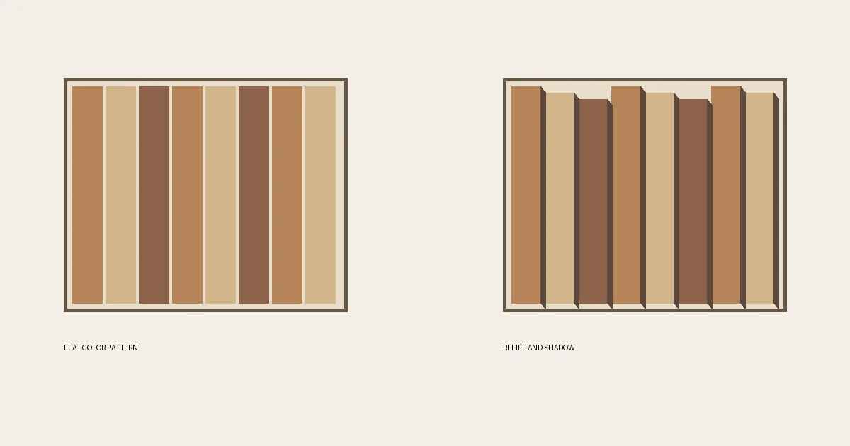
Check a side view of a dimensional piece. The front photograph may hide how far the artwork projects from the wall, and a product’s overall depth can include both its backing and raised elements. Use the stated finished dimensions when considering a narrow passage or a place where people sit close to the wall.
Also consider the light already available. Observe your intended wall during the day and with the room lamps on. A relief panel deserves a location where you like its changing shadows; a flatter piece may suit a spot where a clear color pattern matters more.
The Wood Center decorating guide puts this wall choice in context with floors, furniture and shelving.
Choose a wood palette beside the furniture
Depth sets the character of the surface; color connects that surface to the rest of the room. Compare the artwork with the floor, the nearest large furniture piece and the wall paint. Those surroundings give you a more useful starting point than a wood species name alone.
An amber or reddish panel can repeat warmth already present in a table or cabinet. A muted gray-brown composition offers a different direction beside pale upholstery. Exact matching is optional, and a photograph cannot reliably establish how a finish will look under your own lighting.
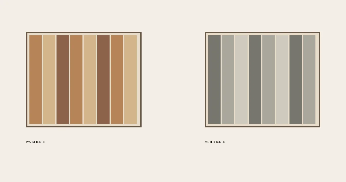
For a mixed-color panel, choose a finish that relates to a substantial part of the room rather than trying to repeat every shade. You might connect its darker pieces with a cabinet and let the lighter scraps contrast with the wall. Avoid adding small accessories solely to account for every color in the artwork.
For the wall panel itself, keep the decision simple: does the overall color feel settled against its immediate background? Judge nearby wood accents against their own backgrounds too, rather than adding them solely to match every strip.
Size the wood panel for the furniture below
With a palette in mind, compare the artwork’s complete width and height with the furniture beneath it. Include the outer border in that measurement. Above a broad sofa, a narrow panel may read as a small accent; a wider composition makes a stronger visual connection to the seating area.
Neither effect is automatically wrong. Decide whether you want a focal point over the sofa or a small piece within a larger wall arrangement. Buying a tiny panel and expecting it to fill the whole wall is where the mismatch becomes frustrating.
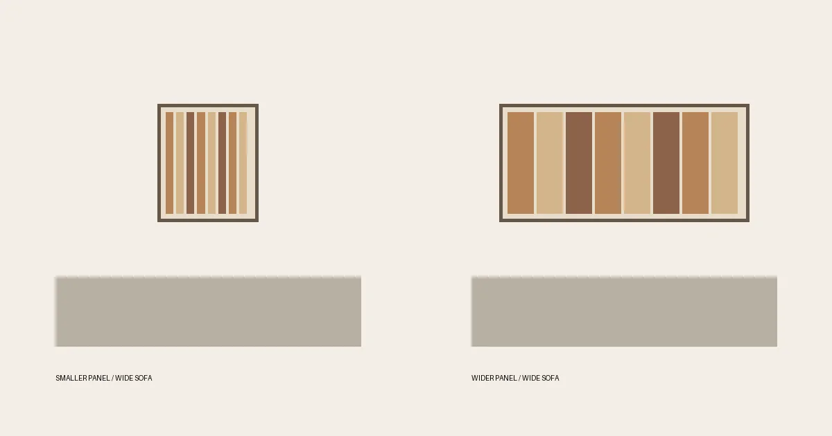
Use a paper outline of the listed finished size to preview its footprint on the wall. View the outline from the seat and from the room entrance. This is a planning suggestion rather than a fixed hanging formula: lamps, nearby windows and the furniture arrangement all affect the available space.
Above a console, include the objects that will remain on the tabletop in that preview. A tall lamp can overlap the visual field of the art. If the panel depends on a central pattern, leave that part visible instead of placing a vase directly in front of it. Check the depth and broad outline of the console beneath the art as well as the objects on top.
Check the finished wood art before choosing its wall
The footprint gives you a location; the actual object determines whether that location is practical. Check the listed weight, backing, hanging hardware and installation instructions. Select wall fixings for the artwork and wall construction using the relevant manufacturer’s guidance. A picture of the front cannot establish a suitable attachment method.
Ask about cleaning when the surface contains deep grooves or rough edges. Follow the maker’s care instructions, especially for painted, stained or unfinished areas. If a piece is intended for indoor display, choose an indoor wall within its stated use conditions.
Material history is a separate question from appearance. Dark stain, nail marks or uneven coloring do not establish that a panel contains reclaimed timber. If recycled or reclaimed material matters to the purchase, look for an explicit description of the wood’s origin or ask the seller to clarify it. The same distinction matters when checking reclaimed-wood claims on furniture: surface marks alone do not establish a previous use.
Finally, keep the neighboring display restrained enough to enjoy the panel. A strongly patterned composition may need little beyond the furniture below it. Once the art is in place, judge the room from the doorway again; add another object only when the wall still needs it.